


I develop every project like a tailor-made suit; creating something unique and original which is skilfully designed to enhance the form and character of your products.
A stylish garment which is bound to attract onlookers and to retain their attention.
My services provide a global, well-coordinated programme to study the identity of your brand, your product and your company; concentrating on the specific nature of every client and enhancing these special characteristics.
I will guide you through the various sections. We will explore the process of restyling historic brands, and the creation of new packaging and projects, closely linked to corporate identity and coordinated with a particular study of the brand. Finally, we will look at the creation of graphic content for web-based systems. What is not obvious on the site, but what guides every project, is the meticulous work of analysis and strategy that underpins the creative phase.


Would you like a consultation to discuss corporate identity, brand image and packaging design? Do you need an integrated publicity project, coordinated with an online presence?
Do not hesitate to contact me. I will know how to find the right solution, and it will be both beautiful and useful.

Or if you prefer social media, look around and get to know the personal profile and skills of Toni Traglia.
![]()
![]()
![]()
![]()
![]()
![]()
![]()
A section designed to give you instant updates on my latest projects. You can explore my most recent worksheets, with many images and detailed descriptions of my design aims.

Aliquip transverbero Virtù di Gola oquor esse ille vulputate exerci veniam fatua eros similis illum valde. Praesent, venio conventio rusticus

Progettista indipendente dal 1997, segue con successo progetti di comunicazione, dando il meglio di sé nel corporate, brand e packaging design.
Influenzato da tanti maestri del design “marketing oriented”, adotta una creatività analitica e strategica mirata a differenziare ogni progetto con soluzioni grafiche che si distinguono per originalità, fascino, funzionalità e pertinenza e che esaltano le potenzialità seducenti del linguaggio grafico-illustrativo.
I suoi progetti di corporate brand e packaging design sono stati premiati con 15 riconoscimenti al Mediastars di Milano: 2 Primi Premi di Categoria, 6 Special Stars e 7 Nominations in short list. I suoi lavori di graphic design sono stati pubblicati in diversi libri e riviste di settore.
Attento alle influenze che agiscono nel settore del design, crede nel web fin dal 1997. Da allora crea, realizza e gestisce online siti, blog, animazioni, banners. Considera i nuovi media come parte integrante di un progetto di comunicazione. Consapevole dei limiti tecnologici del web, integra in modo coerente la comunicazione tradizionale a quella in rete.
Da sempre appassionato di disegno e di pittura continua a coltivare le sue capacità realizzando illustrazioni per la comunicazione. Avendo capito l'importanza del digitale fin dal suo esordio, lavora con il Mac dal 1988 e affianca così al disegno tradizionale quello realizzato con Illustrator e Photoshop.
Si definisce un ibrido tra tradizione e innovazione.
Utilizza la fotografia digitale piegando la tecnologia a favore dell'arte, dove é l'artista a dominare il mezzo e non il contrario.
Ha una forte passione per l'acqua e appena può cerca di tuffarsi in fiumi, laghi, mari. Vince un Primo Premio al Concorso “Fotografare l'Adda” nel 2009 e da allora prosegue una ricerca sui riflessi dell'Adda. Interpreta il confronto tra la luce e il fiume con opere fotografiche che si esprimono più come dipinti che come fotografie. Ha partecipato a diverse mostre fotografiche e pittoriche.
Benché nato e cresciuto in Svizzera ha sempre apprezzato la cultura italiana e, di quest’ultima, soprattutto la cucina. Si diverte a cucinare, ben cosciente che questa é l'ultima parte di una storia che si perde nei tempi italici. Il suo piatto preferito sono le lasagne, senza besciamella però.

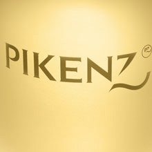
Pikenz – Cosmetic products symbol restyling
Brand of Allegrini Spa, Bergamo
Restyling of the historical brand of the Schiapparelli group (of property of Allegrini Spa).
Also having to maintain the characteristics of the existing logo, included the imbalance on the tail of Z, the fonts are redesigned in order to confer greater authority, prestige and conscious protagonism.
Better Project - restyling brand no food category- to “Mediastars” 2008.

Giovanna Infante – Translation agency symbol
Brand of Giovanna Infante, Lugano (Switzerland)
The objective of the project was to create a personal identity, who is based on the figure of the owner; this explains the choice to bring visually in the symbol the initials of the owner and the profile of an human figure. Take a look at the blog.
 Funky Jazz Dance – Dance course symbol
Brand of Funky Jazz, Fribourg (Switzerland)
The objective was to transmit the energy of the passion for the dance and to represent the spirituality search through the expression of the body.
We used an hard feature to identify “the nontraditional” and the dynamicity of this type of dance.

Pasta Angelina – Fresh handcrafted pasta packaging
Brand of Pasta Angelina, Providencia (Chile)
The project is based on the name of the founder to evidence the artisanal character of the production and the familiar passion that spirit the company.
The italian style is assumed like fundamental factor of the image.
We have adopted the icona of a cherub – with clear callbacks to the Italian art and history - that identified as cook is invested of all the prestige and glorious past.

Veraloe – Restyling of aloe vera products packaging
Brand of Victor Philippe Srl, Pozzo d’Adda (Milano)
Logo restyling to the aim to increase its visibility, its identification and its attractivity.
In consideration that the strategic use of the brand "Veraloe" remains its application on the packaging, it has been maintained the green background modifying it in the form and the colors, to give him more personality and relevance compared to its commodities sector.
At its interior, the interventions on the typography increased the thickness of lettering, cleaning up it also from they existing yellow background.
Another significant intervention considered the highlighting of the letter A that in this way capitalizes better the word "Aloe".

E TRE – "Green" company symbol
Brand of E TRE srl, Merate (Lecco)
The goal was to create a visual identity functional and original that allows to codify the supports of the traditional comunication and of the other one available online.
The new image evidences the tight contact that E TRE cultivates between the nature and the spaces of dwelling in order to favor the protection of the planet. Take a look at the blog.
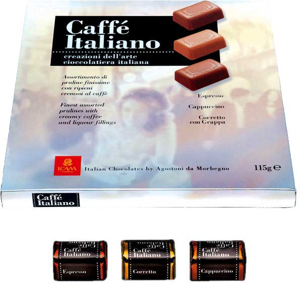
Caffè Italiano – Italian chocolate packaging
Brand of Icam Spa, Orsenigo (Como)
Basic packing of all the line which adopted the Italian style like topic to dress this new range of chocolates, dedicated especially to export.
Italy of flavours - with its cultural, social and natural patrimony- has been taken like visual testimony of the originality of these chocolates
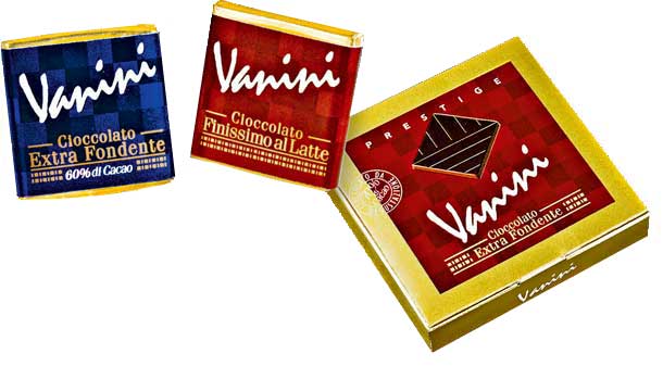
Vanini – Superfine chocolate packaging
Brand of Icam Spa, Orsenigo (Como)
Packaging design of a line of high-quality chocolates.
An elegant and simple graphical solution emphasizes the refinement of the product.
The thin differences of tonality of the mosaic's background evoke the delicate facets of the aromatic cacao mixture contained in these recipes.
The strong presence of gold confirms the nobility of the product. The sheath of the milk version is declined with the tonalities of the blue reflex.
Wool Club – Textile products packaging
Brand of Lanerossi Spa, Schio (Vicenza)
On behalf of Carcano & Associati agency, restyling of the packaging for a wool's yarn line. The objective of the job was to improve graphically the quality and the prestige of the product, to the top of the range Lanerossi.
Conceptually, the yarn is interlaced in order to become woven thus forming a vertical graphical symbol with strong impact. The line lives without colors exalting the exclusivity of the range.
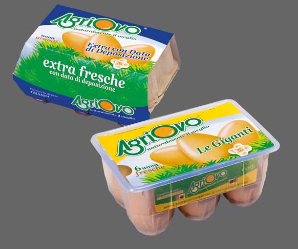
Agriovo – Egg products packaging
Brand of Agriovo Srl , Eboli (Salerno)
Restyling of the packaging design of a family of eggs.
The client's request was to communicate visually and in strong way, the naturalness and the kindness of the product.
The fil rouge between various confections is a graphical basis with strong impact, constituted of eggs, grass tufts and a flower, designed with sharp flat inks. These elements communicate kindness with a simple and attractive semantic code.
The later element of connotation is the representation of whole eggs as the callback to the egg yolk is integrated in the lettering of the logotype.br>
Ulteriore elemento connotativo è la raffigurazione delle uova intere in quanto il richiamo al tuorlo è parte integrante del logotipo.
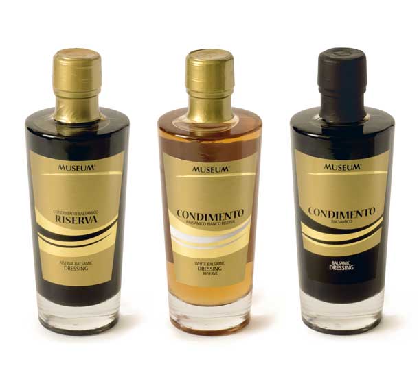
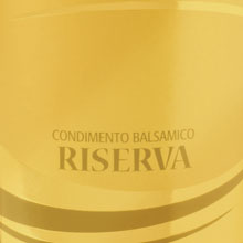
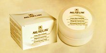
Museum - balsamic dressing packaging
Brand of Oleificio Cisano Srl, Bardolino (Verona)
Award for Best Packaging of the Year 2019 at 23th Mediastar in Milan
The award-winning packaging design was born from the need to standardize graphically the many references that Museum offers with different brands.
To differentiate the product types, the premium ones live on a gold background while the less exclusive ones are printed on a white background.
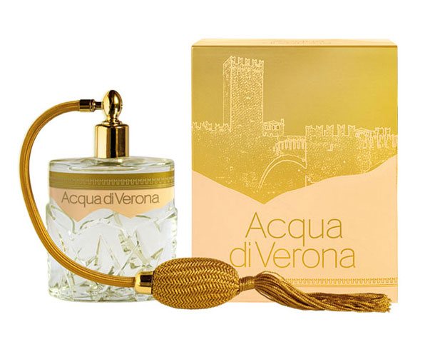
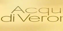
Acqua di Verona – Perfumery products packaging
Brand of Christian Ross s.r.l.
The graphic design of the packages interpret with elegance the sight of the Italian historical places.
The development of the range begins with this "Acqua di Verona", represented by the illustration of the famous scaligero bridge of Castelvecchio,in order to continue with Acqua del Duomo with the silhouette of the Dome of Milan and to conclude with Acqua di Amalfi, characterized from the houses of the ancient village lengthened on the sea.
Nomination in Short List at XIII° Mediastars of Milano. Brand and packaging design to Acqua di Verona's confections.
Nomination in Short List at XIII° Mediastar of Milano.

Brand e packaging design per una linea di confezioni di acqua di profumo. Basandosi sulla fisionomia del flacone esistente, la grafica degli astucci riprende con eleganza lo storico ponte scaligero. Blog.
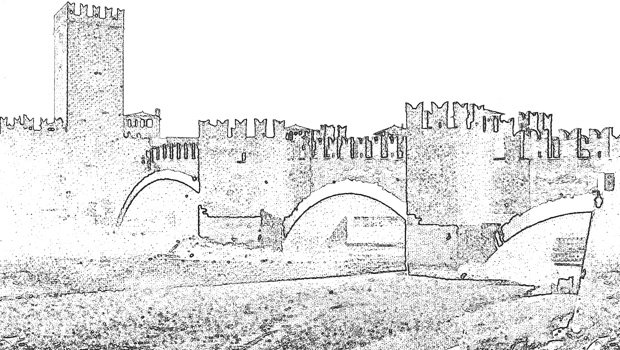
Acqua di Verona – Perfumery product illustration
Brand of Christian Ross s.r.l.
The graphic design of the packages interpret with elegance the sight of the Italian historical places.
The development of the range begins with this "Acqua di Verona", represented by the illustration of the famous scaligero bridge of Castelvecchio.
Nomination in Short List at XIII° Mediastar of Milano.
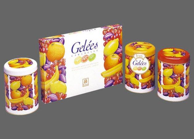
Gelèes – Candy products packaging
Brand of Icam Spa, Orsenigo (Como)
Restyling of the packaging design of a line of fruit's jelly candies.
Maintaining the typical elements of this commodities sector we have invested on the illustration of the fruit like recognizable element of the line.
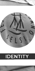
Festa del Grano – Cultural event symbol
Brand of the Associazione Culturale Comitato Sant’Anna, Jelsi (Campobasso)
The symbol - Festa del Grano Jelsi - represents a “traglia”, the typical slips in wood for the agricultural transport on inclined lands, encircled of an aureole of devotion, that it marks thus the sacred aspect of the recurrence. The colors used, yellow and blue, remember the grain and the sky in its real and supernatural meaning.

Pasta Angelina – Fresh organic pasta packaging
Brand of Pasta Angelina, Providencia (Cile)
Packaging design for the products take away of an Italian artisanal pasta producer in Chile. The packaging it is part of a wider plan of corporate identity.
The containers contain the fresh pastas precooked and are dedicated to the Chilean market.
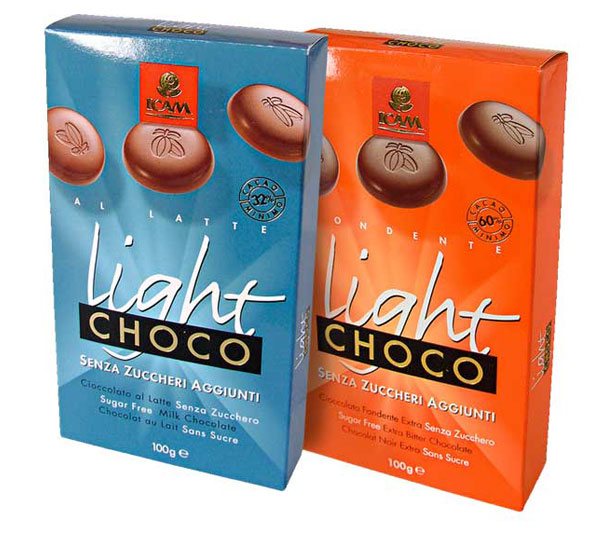
Choco Light - Chocolate products packaging
Brand of Icam Spa, Orsenigo (Como)
Packaging design of a line of chocolates without sugar.
Task of the designer was to communicate lightness and dynamism.The solution exploited the freshness of the luminous colors in harmony with the energetic graphic elements.
![]()
Noli – Italian Kitchen logo and symbol
Logo and symbol of Noli Modern Kitchen, Cincinati (USA)
The design of the logo and its symbol is based on the concept of modularity of the kitchens and the freedom to assemble the components.
To achieve these goals, we have chosen the square as the basic element of the work. We decided to use it as a structure to design the logotype.
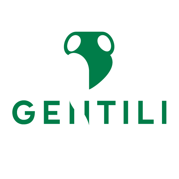
Gentili – Italian handcrafted extra virgin oil, logo and symbol
Brand of Frantoio Gentili, Farnese (Viterbo)
The aim of the project is to give greater functionality and credibility to the image of the products, investing in design to enhance a bicentennial history.
For this reason, the graphic design re-proposes the amphora as a link between tradition and future challenges. A substantial redesign of the logo/symbol is necessary to affirm this behaviour.
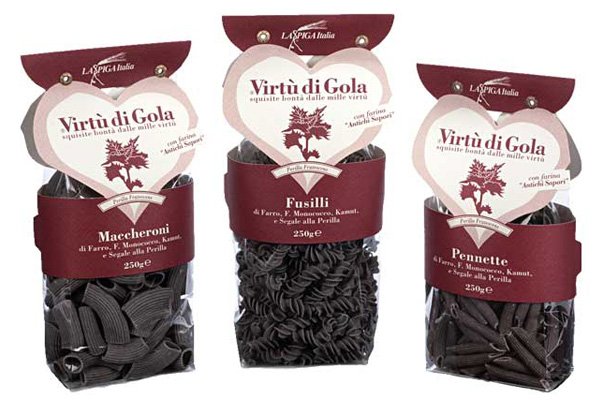
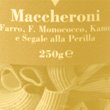
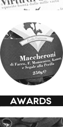
Virtù di Gola – Organic pasta packaging
Brand of La Spiga Italia snc, Verrua Po (Pavia)
Brand and packaging design to create, around this new line of organic products with innovative ingredients, the sympathy for “the things that are healthy”.
The strong element - that connotes all the confections - is a great heart that expresses the sincere love for the kindness that this pasta represents.
The pasta“Virtù di Gola” is a rich innovative product of useful substances for the organism between which the Perilla, plant of Chinese origin, rich of omega 3 and from the anti-allergic properties.
Moreover, in kitchen, it is appreciated from chefs for its particular flavour.

Volontari dell'Adda - Voluntary association symbol
Brand of Associazione Volontari dell’Adda Onlus, Canonica d’Adda (Bergamo)
The job has considered the design and the graphical realization of the symbol and the typographical interpretation of the name “Volontari dell'Adda”.
The symbol of the hands which meet evokes the solidarity and the water of the river.
After, we created the codes of the visual system which define the corporate identity with its application on the various supports of communication.
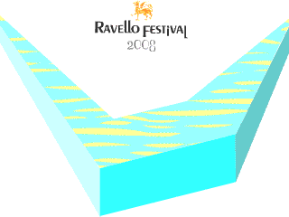
Salvatore Ferragamo - Historical shoes animation
Ravello Festival, Ravello
The project is born in the context of the Festival di Ravello and introduces the historical shoes of the designer as if they were in footbridge. Realized with the GIF animated for the use on the mobiles. Take a look online

Elegant – Cosmetic products packaging restyling
Brand of Christian Ross Srl, Milano.
Restyling of the packaging design of the Elegant creams.
The goal was to push the image of the products inside its market putting it more near its target, and giving it more prestige and coherence.
Nomination in Short List at XIII° Mediastars of Milano.
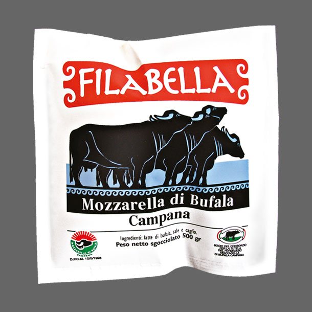
Filabella – Buffaloes mozzarella packaging
Brand of Filab Srl, Bellizzi (Salerno)
Packaging design of a mozzarella line of buffaloes.
By representing the famous bovines - and in order to place territorial and culturally the product - we have adopted a design of clear graphical inspiration to the original culture.
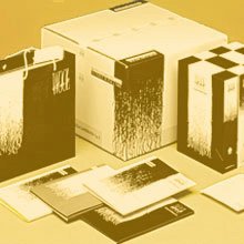
 L'Altrapasta – Organic pasta magazine
Inner of the magazines that describe and illustrate the various types of organic pasta. We updated the typographic elements giving more autority and credibility.
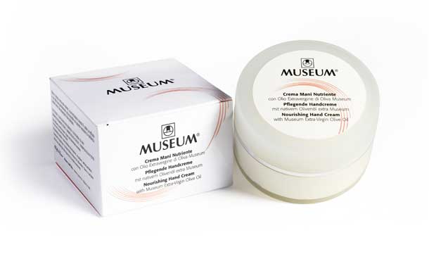 Museum - Cosmetic products packaging
Brand of Oleificio di Cisano Srl, Bardolino (Verona)
Restyling of a cosmetic line made up with extra virgin oil of olive.
To preserve the visual patrimony of the current products on the market of several years, we decided to maintain the old chromatic range which is used to distinguish the packagings.
The design has been brought up-to-date instead in way enough hard, in its forms, adopting an elliptic graphical sign that symbolizes an olive.
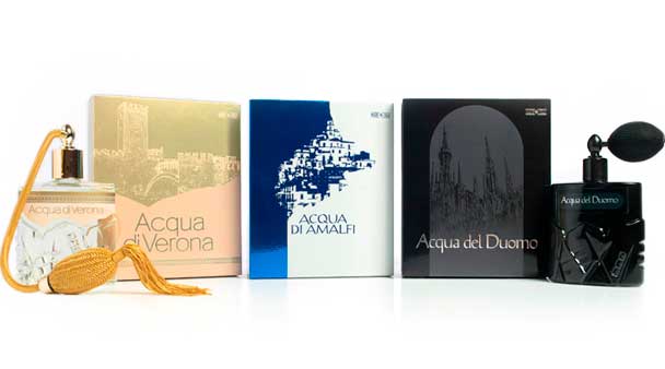
Acqua di Verona, del Duomo, di Amalfi – Perfumery products packaging
Brand of Christian Ross s.r.l., Milano
Based on the appearance of the existing bottle, the drawing of the cases illustrates with elegance the view of the Italian historical places.
The development of the range begins with Acqua di Verona, represented from the famous scaligero bridge of Castelvecchio, in order to continue with Acqua del Duomo with the silhouette of the Dome of Milan and to conclude with Acqua di Amalfi, characterized from the houses of the ancient village lengthened on the sea.
Nomination in Short List at XIII° Mediastars of Milano. Brand and packaging design to Acqua di Verona's confections.
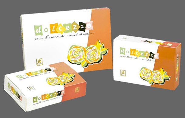
Dolcezze – Candy products packaging
Brand of Icam Spa, Orsenigo (Como)
For this restyling of an assorted candy line we have decided to take again the concept of gift floreal on the pack and to interpret the lettering like so many packed candies.

Icam - Italian chocolate packaging illustration
Icam Spa, Orsenigo (Como)
Italy is the adopted topic in order to dress this range of new products. The illustration represents a couple taking a coffee break inside the gallery Vittorio Emanule of Milan. The job was realized with Photoshop.
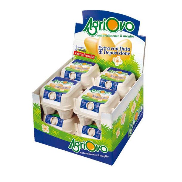
Agriovo - Egg container display
Brand of Agriovo Srl , Eboli (Salerno)
Restyling of a container for packaging with 4 eggs.
The eggs on the grass background adopt the dominant topic of Agriovo line, illustrating the natural goodness of the products.
Better Project container food to “Mediastars” 2008.
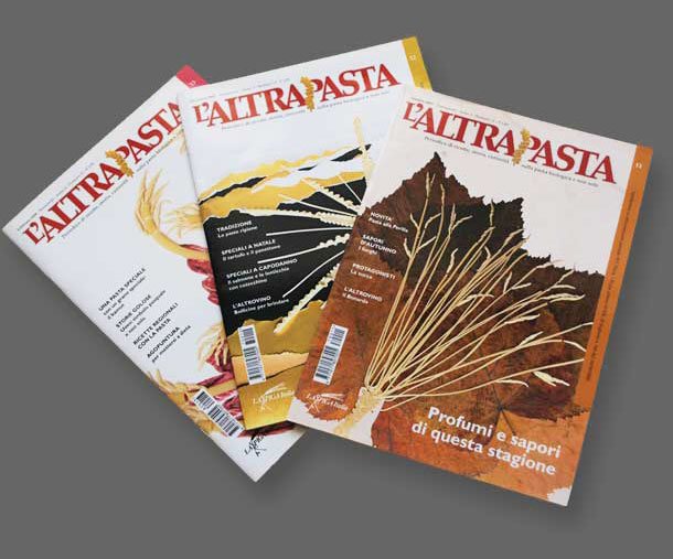
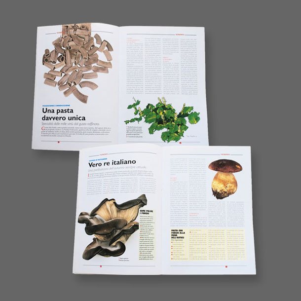
L'Altrapasta – Organic pasta magazine
Brand of La Spiga Italia snc, Verrua Po (Pavia)
We gave a new graphic dress to this magazine of artisanal pastas. The main aim consisted in reaffirming more authority and credibility.
Also by maintaining some structural choices, the graphic design was modernized while choosing more harmonious and more attractive solutions.
The contribution of photographic and illustrative images made possible to obtain more attractive contents. The illustrations of the covers expressed with great personality the themes considered by interpreting directly with the pasta the various events considered in the magazine.