toniTragliaGraphicDesign

Gentili – Italian handcrafted extra virgin oil, logo and symbol

Read more


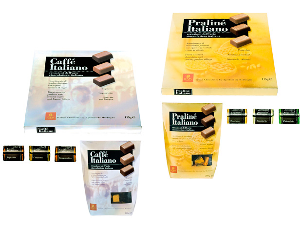
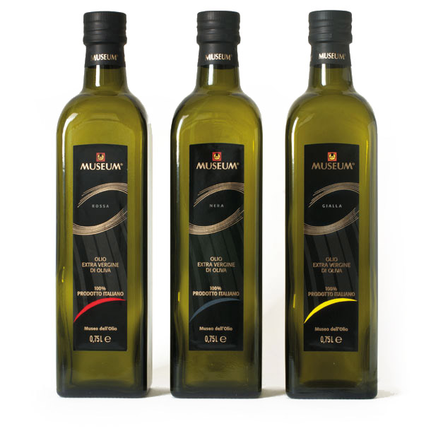
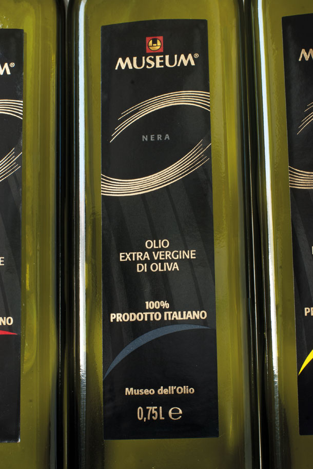
Brand of Frantoio Gentili, Farnese (Viterbo)
The aim of the project is to give greater functionality and credibility to the image of the products, investing in design to enhance a bicentennial history.
For this reason, the graphic design re-proposes the amphora as a link between tradition and future challenges. A substantial redesign of the logo/symbol is necessary to affirm this behaviour.


toniTragliaGraphicDesign

Noli – Italian Kitchen logo and symbol

Read more

Logo and symbol of Noli Modern Kitchen, Cincinati (USA)
The design of the logo and its symbol is based on the concept of modularity of the kitchens and the freedom to assemble the components.
To achieve these goals, we have chosen the square as the basic element of the work. We decided to use it as a structure to design the logotype.


toniTragliaGraphicDesign

Pasta Angelina – Italian handcrafted pasta symbol

Read more

Brand of Pasta Angelina, Providencia (Chile)
The project is based on the name of the founder to evidence the handicrafted character of the production and the familiar passion that spirit the company.
The italian style is assumed like fundamental factor of the image.
We have adopted the icona of a cherub – with clear callbacks to the Italian art and history - that identified as cook is invested of all the prestige and glorious past.


toniTragliaGraphicDesign

7Sensi - Italian handcrafted beer logotype

Read more

7Sensi – Logo for an italian artisanal beer
Brand of 7Sensi sas, Abbiategrasso (Milano)
The project is born from desire of giving form to the remarkable experience matured from the activity of 7Sensi in the field of the beers.
The new logo, therefore, is passion and professionality expression and transmits to these qualities with originality, thus asserting an own interpretation of the Italian style.
Roundness of the tail of the number 7 donates sensuality and feminine character. Take a look at the blog.


toniTragliaGraphicDesign

Creating a strong, flexible corporate identity allows you to coordinate all your visual communication systems and so achieve recognisability.

toniTragliaGraphicDesign

Blue Rose – Confectionary products logotype

Read more

Brand of Icam Spa, Orsenigo (Como)
Restyling of the logo for a line of hazelnut chocolate.
The job has considered the restyling of the lettering in order to bring up-to-date the tradition by conferring more prestige and coherence.


toniTragliaGraphicDesign

Festa del Grano – Cultural event symbol

Read more

Brand of the Associazione Culturale Comitato Sant’Anna, Jelsi
The symbol - Festa del Grano Jelsi - represents a “traglia”, the typical slips in wood for the agricultural transport on inclined lands, encircled of an aureole of devotion, that it marks thus the sacred aspect of the recurrence. The colors used, yellow and blue, remember the grain and the sky in its real and supernatural meaning.

toniTragliaGraphicDesign

Giovanna Infante – Translation agency symbol

Read more

Brand of Giovanna Infante, Lugano (Switzerland)
The objective of the project was to create a personal identity, who is based on the figure of the owner; this explains the choice to bring visually in the symbol the initials of the owner and the profile of an human figure. Take a look at the blog.
E TRE


toniTragliaGraphicDesign

E TRE – "Green" company symbol

Read more


Brand of E TRE srl, Merate (Lecco)
The goal was to create a visual identity functional and original that allows to codify the supports of the traditional comunication and of the other one available online.
The new image evidences the tight contact that E TRE cultivates between the nature and the spaces of dwelling in order to favor the protection of the planet. Take a look at the blog.
Caffè Italiano

toniTragliaGraphicDesign

Caffè Italiano - Confectionary products logotype

Read more

Caffè Italiano - Logo for confectionary products, Brand of Icam Spa, Orsenigo (Como)
The italian style like topic in order to dress this new line addressed towards the export markets. The typographical work, based on the Bodoni character, has involved the definition of a flexible graphical system to apply to an articulate range of products and communication supports.
simbolo oliva Museum


toniTragliaGraphicDesign

Museum – Cosmetic products symbol

Read more


Brand of Oleificio Cisano Srl, Bardolino (Verona)
The sign, which symbolizes an olive, was born in order to identify with a strong and functional symbol the new line of Museum extra virgin oil.
Beyond being suitable, the symbol has the characteristic to adapt to the most various formats and technologies of the press.
The represented olive can change of dimension , modifying part of its form, also remaining always much recognizable. It is inserted in an elegant and distinctive way on the oil bottles and on the cosmetic products.
logo Elegant


toniTragliaGraphicDesign

Elegant – Cosmetic products logotype

Read more

Brand of Christian Ros Srl, Milano.
Restyling of the logotype of a line of cosmetic products.
Also updating the existing typographical structure, the logotype is cleaned with more personality, carrying the brand to its market of reference.
logo Virtù di Gola


toniTragliaGraphicDesign

Virtù di Gola – Organic pasta products logotype

Read more


Brand of La Spiga Italia snc, Verrua Po (Pavia)
Project of brand design to create, around this new line of organic products from the innovative ingredients, the sympathy for “the things that are healthy”.
Adopting the style of the famous chefs, with a clean and elegant design, we revealed the quality and the goodness that this pasta represents.


toniTragliaGraphicDesign

Whereas in the past, it was enough to have a good logo, you now need a wider and more transversal graphic-based approach, to create global systems of visual identity that help consolidate brand values.


toniTragliaGraphicDesign

Veraloe – Organic health products logotype

Read more


Brand of Victor Philippe Srl, Pozzo d’Adda (Milano)
Logo restyling to the aim to increase its visibility, its identification and its attractivity.
In consideration that the strategic use of the brand "Veraloe" remains its application on the packaging, it has been maintained the green background modifying it in the form and the colors, to give him more personality and relevance compared to its commodities sector.
At its interior, the interventions on the typography increased the thickness of lettering, cleaning up it also from they existing yellow background.
Another significant intervention considered the highlighting of the letter A that in this way capitalizes better the word "Aloe".


toniTragliaGraphicDesign

Pikenz – Cosmetic products logotype

Read more

Brand of Allegrini Spa, Bergamo
Restyling of the historical brand of the Schiapparelli group (of property of Allegrini Spa).
Also having to maintain the characteristics of the existing logo, included the imbalance on the tail of Z, the fonts are redesigned in order to confer greater authority, prestige and conscious protagonism.
Better Project - restyling brand no food category- to “Mediastars” 2008.


toniTragliaGraphicDesign

Volontari dell'Adda - Voluntary association symbol

Read more


Brand of Associazione Volontari dell’Adda Onlus, Canonica d’Adda (Bergamo)
The job has considered the design and the graphical realization of the symbol and the typographical interpretation of the name “Volontari dell'Adda”.
The symbol of the hands which meet evokes the solidarity and the water of the river.
To follow, we created the codes of the visual system which define the corporate identity with its application on the various supports of communication.

toniTragliaGraphicDesign

Funky Jazz Dance – Dance course symbol

Read more

Brand of Funky Jazz, Fribourg (Switzerland)
The objective was to transmit the energy of the passion for the dance and to represent the spirituality search through the expression of the body.
We used an hard feature to identify “the nontraditional” and the dynamicity of this type of dance.


toniTragliaGraphicDesign

Ofmec – Mechanical laboratory symbol

Read more


Brand of Of.Mec.C. snc, Vaprio d’Adda (Milano)
Symbol for a manufacturer of stamps for fusion of the light alloy.
The symbol evokes the typical shell structure of the stamps and their resistance to the heat during theirs use.


toniTragliaGraphicDesign

Agriovo – Egg products logotype

Read more

Brand of Agriovo Srl , Eboli (Salerno)
Restyling of the logo in order to communicate, in more obvious way, naturalness and kindness.
The intervention on lettering, updating also the identification of the logo, created softer and natural lines, more indicated to a food product.

toniTragliaGraphicDesign

Next Era – IT consulting logotype

Read more


Brand of Next Era, Lugano (Switzerland)
The goal was to create a pixel effect so as to mark the fonts with digital typical elements used in this field's activity. The design of the pixel establishes a proportion that simulates a fixed resolution when the logo changes dimension.
toniTragliaGraphicDesign

info@tonitraglia.com
tel: +39 340 30 75 068
IVA 02624260168

facebook spazio You Tube spazio Linkedin