
The first request of the customer was to create a design which dissociated the products with the traditional olive oil; no green, no traditional iconography. First we launched the colored version, this is why the design of the packaging line is based on this model. The project has been a great success and the awarded labels liked immediately. The colored version was born to represent the style and the Mediterranean culture, indeed this olive oil is produced in the countries of the south of Europe. This is why we put the olives in the sun on the sea with the sailing boat.
The bottles are really conventional and it is why the customer asked to follow an no conventional way with the design. It was impossible to change the containers and it was however necessary to give a great personality to this products. Of course, there is also a label on the back for further information.


Less is more
These products are not addressed to mass market consumers and they live in a museum of olive oil and on the museum’s eshop. This is the first reason why we don’t need to be extremely clear to show that they are bottles of olive oil.
The second reason is why the containers are enough particular to sale alone the olive oil, we don’t need label. In Italy, these bottles are in use only to contain olive oil. Less is more of course in these awarded labels!
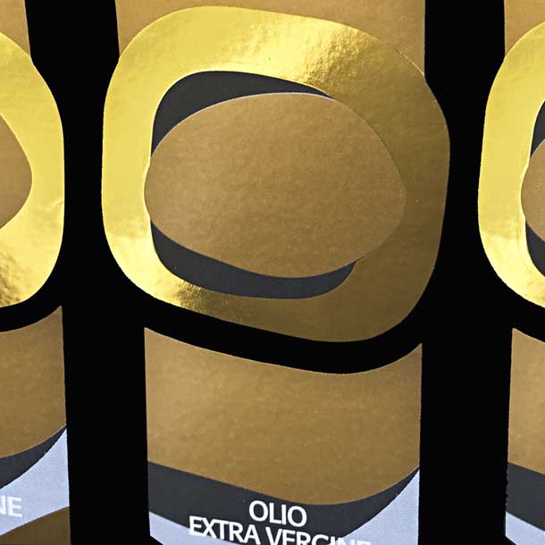
The blue version is a good product but of lower quality compared to the Gold version. After I created the first colored label, the client found it very well and he decided to insert in this line a top product, the gold version.
But the colored version wasn’t born to represent top products!
To give a clear difference of the quality between the products, we decided to change the colors but the behavior too; this is why we gave up showing the sailing boat illustrated on the colored version.
To keep coherence between the typographical design of the different labels, we decided to maintain the text “Olio Extra vergine di Oliva” in the same font family and position like on the colored version.
Click here to see more projects of packaging design. Enjoy!


