
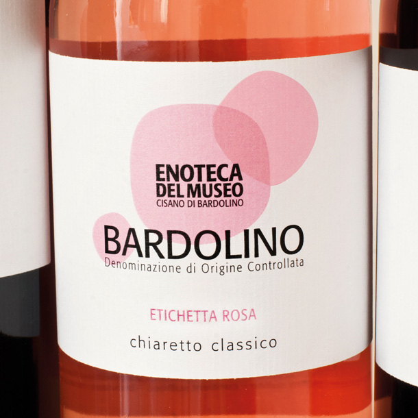
The project started as a restyling of the brand and packaging design of a line of wine labels. It was not recommended to maintain the old idendity, therefore the client decided to not preserve a part of the present graphical identity and the job begins with a new graphic design. To following a pleasant approach, the idea behind this project developed around three wine drops of wine that will mark the bottles. After various verifications we decided to adopt a modern and synthetic graphical treatment which interprets the drops in a nearly abstract way that still remains very identifiable.
Project system with scaleable design
The logo lives with a well readable “sans serif” font. A clean typeface contributes to maintain a good sobriety of the logo/symbol composition. The system has been designed to be scaleable to support the new applications. On the front, the drops increase covering in wider way the image of the products. Instead, on the back, the composition remains in the original dimensions. The line includes 5 items which are distinguished by their 5 color tonalities: Rosa, Rossa, Verde, Gialla e Nera (pink, red, green, yellow and black). The project was realized with Adobe Illustrator and was printed in digital quadrichromy.


Click here to see more projects of brand and packaging design! Enjoy!