
This project of brand and packaging design was born with the aim to actualize the great experience which 7sensi enterprise has gained in the beer field. Thus we meant to create a new range of products which would express professionalism and passion, but also originality, in order to reinterpret Italian style. We wanted to refer strongly to craftsmanship, but nevertheless offering a modern appearance, avoiding symbols which are too traditional.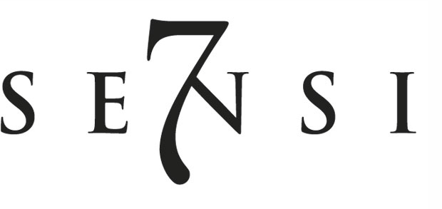
Logo sculpted on marble
Firstly, dealing with the logo, we didn’t want to keep the one which already existed for the brand; we chose to look for unexplored and more moving qualities. The new lettering was based on Trajan, a character which goes back to the ancient engravings which Romans sculpted on marble plaques. Its gracious and majestic proportions lend it authority and the history behind its signs recalls Italian traditional culture.
Character which has never existed
On the other hand, as already stated, excessive traditionalism had to be avoided. Therefore we used the number 7, which has got almost a desecrating role: it dominates the “N” completely and assimilates part of the appearance of this letter, creating a character which has never existed before. Thus the logo looks modern and the drop-shaped base of the number plunge it into the depths of sensuality.
This pondered provocation laying within the shape of the “7” recalls the curves of the female body, so our logo is very peculiar, without losing any functionality or versatility


Design of quality
Similarly, the labels guarantee the quality and the craftsmanship of our product in an original way, too. The form of the hop shapes the texture of the tag’s background, even more evidently on the front of the bottles. This reveals the crucial importance of the hop- a fundamental ingredient for beer- and affirms its authenticity. It was represented graphically with spot colors, making it more of a decorative element rather than an illustration.
his choice has allowed the texts and the typesetting to be made with great ease, without the need of any formal device for readability. In fact the way the texts are inserted on the front is very natural, with no use of artifices, recalling the authentic quality of the products. Different layers of meaning and communicative functions hide within the figure of the hop, making modern and original a typical symbol of the beer tradition.
Modernity with discretion
Modernity also lays in the fact that a metallic base was used for printing. It is marginal and can only be seen on the side of the labels, therefore its aim is not to point out an essential part of therm. Actually, it is there to emphasize the hop’s shape. It creates a functional contrast between lucidness and dullness. Colors have been chosen keeping in mind that women are part of our target, avoiding masculine tones. There aren’t strong chromatic contrasts: the tones differ lightly and delicately.
The line was born with two references, the “Perspective” blonde and it red “Magnetic”. Their labels chromatically entrust to the colors yellow and red, the two traditional dial tones of those beer tipology. At last it has been produced the more Premium of the family, the Double Malt that differs from the others because it adopts a metalized forehead that instead opaque. This référencene does not live in the stores, but only in the channels of restoration and of luxury hotel.
Click here to see more projects of brand and packaging design. Enjoy!